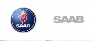
 Saab’s “new” logo isn’t really new. It’s the result of pragmatics, convoluted ownership history and licensing restrictions.
Without going into too much of the historical trials and tribulations of the company that has come back from bankruptcy, and currently has yet another owner (NEVS), the bottom line is that the griffin is gone. At least from the cars. The crowned griffin (half lion, half eagle) logo, is currently in use by Saab AB (the aerospace company) and Scania (the truck company) who did not grant the rights to it on SAAB cars.
Personally, I was never much drawn to the SAAB brand so I will miss its not-quite-iconic logo less than its renowned aficionados. Of course, the wordmark remains, though its use in a circle (on vehicles) feels a bit close to DELL’s logo for me.
It’s an interesting case less for the logo and more as an example of the brand identity restrictions brought about by complicated ownership history. And at least this was not just another arbitrary logo redo.
