![]()
 I have to admit that I have a soft spot for AA, and have enjoyed the benefits of ExecPlat status for many a year. I can’t deny the operational and service problems they have had of late, which of course mold the brand experience for most passengers.
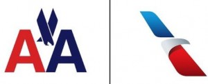
I want to like the new logo and livery, but I’m struggling. AA was like Ford and IBM to me – they had an almost timeless logo which required only minor modification. The new livery feels unbalanced with that heavy handed design on the tailfin.
By the way, AA has released a new TV commercial to accompany the rebrand. Take a look. I find it conceptually uninspiring. We’re told that things are “different, new, better,” yet it’s not clear why. And the tired device of people gazing up to the skies in wonderment really needs to be paid off with something more revealing and substantial than the tailfin of some plane. A change in the air? Plus ca change,…..